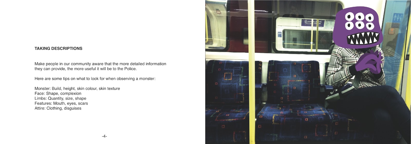
What Is Graphic Design?
The obvious answer would be that graphic design is the design of graphics! But what is graphics? The phrase ‘visual communication’ is used a lot, and the idea of using imagery to solve a problem. When you think graphic design, you think all aspects of visual mediums. Theres illustration, photography, typography, moving image, and so on. Graphic designers are constantly described as people who use visual sources to help brand and sell an idea, advertising to the public. Graphic designers are known as being problem solvers and people who use imagery only if it is needed for its overall purpose. The colour, the layout, even the font has to all fit in correctly in order for a good piece of graphic design to work. However, looking into what graphic design is all about, it is still hard to pinpoint what exactly graphic design can solely be labelled as being, even more so it is hard to label any type of visual as just the one form of art, whether that be graphic design, illustration, fine art, and so on. The context in which the visual is in plays a big part in determining its visual state. A fire exit sign placed above a door is merely a piece of graphic design, telling you plain and clearly its purpose. However, place that fire exit sign in a modern art gallery above a toilet and it becomes fine art. There is the debate that fine art has no overall meaning but is free to interpretation, and that fine art is merely for the sake of art and is not intended to make money off of it. But in the world that we live in today it is hard to agree with such a statement, and even so with the impression that all graphic designers are business minded who are out working to get money. There are all types of people out there, in all types of circumstances, who would class themselves as graphic designers. So back to the original question of what is graphic design? Once again we think visual communication, a piece made to solve a problem and have a clear meaning. Fore if the meaning is not clear then surely it isn’t a good piece of graphic design. Or is it? The nike swoosh symbolizes victory, speed, elegance and even greek mythology. You wouldn’t get all those interpretations just by looking at the logo, but that doesn’t mean it isn’t a great piece of graphic design. So it is evident that a clear meaning is not always relevant in the thinking of what graphic design is. What about this idea of problem solving? many things manmade in this world are created to solve a problem. It is in our human nature to always improve on what is already available, because as humans we are never satisfied. Even the most unimportant thing created by man was created to solve a problem, however small that problem may be. The problem does not have to be so big as solving world hunger, for example. But as small as solving the problem of what to do on your weekday off? Therefore, it is correct to say all things created in this world were created to solve a problem. Now, as for graphic design having to be visual, does that necessarily have to be true. Many times it has been evident that a graphic design project was successful due to the spoken words added to a visual. Take away the visual and that graphic design piece could still be successful as its own. There has been times where music has been used for a graphic design piece, which ticks the two boxes of giving out a message and having reason behind it. Saying that graphic design doesn’t have to be visual is a hard thing to grasp however, but going back to it needing to be visual doesn't mean it has to be on a canvas of some type of monitor screen. If you ask yourself what out there is most effective in visual communication, is it not right to think humans ourselves are. As humans, our actions are constantly visual, and actions are always created for purpose and reason, even if that purpose is as small as wanting to scratch your nose due to an itch. So with that in mind, are we not graphic designs ourselves? Can not all living things be classed as pieces of graphic design? Looking more into this, the idea of not only living things being graphic designs, but just about anything created by man to be graphic design. Everything we create is created for purpose and meaning and with reason. A brick is created to build and is designed to attract those wanting to build as it sends the message out as being a strong, compact, reliable material. An earring is designed to make the wearer stand out, and feel attractive, which in turn attracts the seX they intend to attract. All these things follow the laws of what makes graphic designs a piece of graphic design. So overall it is so hard to state what graphic design is, and can’t merely be done through the use of imagery, whether it be illustrated, moving image, typography, or so on. The subject is so broad and at the same time so unclear that it is hard to give a clear definition. The idea of it being visual communication is of course, completely true, but there are so many ways you can take that definition and head into all types of angles of theory with it. Overall, the idea of communication seems to be the clear necessity in wanting to define graphic design, but to class something as not communicating is a very hard thing to say for people interpret and communicate with things in different ways all the time.


.jpg)
.jpg)
.jpg)